- Bespoke Software
- IT Support
- Digital Marketing
-
Telecoms
Services
- Our Telecoms Services
- Business Mobile
- Hosted VoIP Provider
- Business VoIP Systems
- Business Broadband
- Leased Lines Provider
- 3CX Systems
-
Web
Design
- Our Web Design Services
- Bespoke Website Design
- eCommerce Website Design
- Pay Monthly Websites
- Branding & Design
- Mobile App Development
- Web Hosting
- Cyber Security
-
Developer
Course
- Our Developer Course Services
- Train For A Career In Tech
- Skills Bootcamp
- Scion Scheme Frequently Asked Questions
- Scion Collaborators
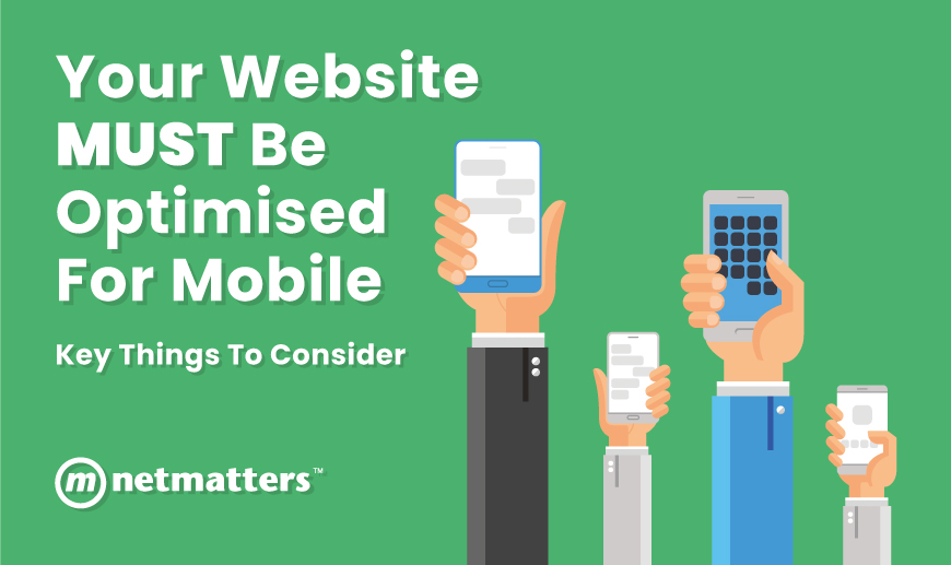
Your Website MUST be Optimised for Mobile (Key Things to Consider)

Posted by Netmatters
FORTY-SIX.
That’s how many times the average consumer checks their smartphone each day with 91% of people having their smartphone within arm’s reach 24/7, even whilst they sleep.
Of those people, a further 48% stated that if a website is not mobile-friendly, it signified that the establishment just doesn’t care about their business – ouch!
With 9/10 mobile searches resulting in the consumer taking action, can your business afford to be behind the curve?
You don’t need stats to understand how much mobiles are now deeply rooted into our daily lives. Yet surprisingly, so many SME’s still fall victim to an un-optimized website due to lack of knowledge and a poor understanding of the magnitude of mobile search.
What does it mean to have a mobile optimised website?
Simply put, a mobile optimised website is one that adapts when shown on a handheld or tablet device. This includes navigation buttons, menus and image sizing. It also addresses site structure and page speed.
When customers land on a mobile-optimised website, they are greeted with an easy to use, quick loading website experience that doesn’t make them run for the hills.
How a mobile optimised website benefits your business and customers
- Improved user experience – a website that does not adapt to a mobile device will not encourage consumers to browse. A streamlined site with an easy journey and conversion funnel will drive more visitors to the end destination, whether that be a checkout, contact form or phone number click. It can also improve the chance of these customers returning to make additional purchases, read your content and generally interact with the site further.
- Increased session time – the average human has an attention span of eight seconds and if you haven’t gripped someone in that time, it’s unlikely you’ll get them back. An effectively optimised website can increase the amount of time your consumers want to spend on your site, driving more opportunity for conversions.
- Competitive edge – with so many SME’s not recognising the need for a mobile optimised website, it’s a great opportunity to keep your business ahead of the game and provide your customers with a better website experience than your competitors
Google loves mobile optimised websites:
On average, Google experiences 700,000 searches per minute. As the search engine king they make the rules.
They receive over 60% of mobile searches per year so it makes sense that your mobile website needs to deliver an all-round positive experience when it’s discovered through a mobile search result.
And with the March 2018 announcement of mobile first indexing, ensuring the highest mobile standards should be your number one priority.
Key Things to Consider When Optimising for Mobile
The good news is just because your website isn’t yet mobile ready, doesn’t mean that it can’t be.
1. Make your website responsive – responsive websites change the way your content and information is displayed and arranged based on the size of the screen being used to view your website.
2. Don’t use flash – it slows down page load speed and isn’t supported by Android or iOS, arguably the most used phones with consumers. Flash is software that was popular during the early days of the internet. The web has moved away from Flash in favour of HTML5 which requires no plugins and is fully supported by all browsers and mobile devices.
3. Compress your images - high resolution images come with a large file size, again slowing down the speed of your site.
4. Consider sizing – make buttons and fonts the appropriate size for the mobile site making it easy to read and navigate throughout the user journey.
5. Regularly perform mobile testing – as technology continues to develop, the requirements for an optimised site may also change. Regular testing ensures you are always ahead of any changes.
Netmatters can ensure your website is optimised for mobile.
Knowing where to start can be the hardest part when it comes to on-page optimisation. Especially if it’s not something you’ve done before.
With that in mind, our final tip is to get in touch with the experts.
Our dedicated team of web developers are experts in taking your website from desktop to mobile to provide the greatest experience possible for your customers, to drive conversions and take your business to the next level.
Use the contact form below to get in touch with our team of friendly, knowledgeable experts. Alternatively, call us on 01603 515007.