- Bespoke Software
- IT Support
- Digital Marketing
-
Telecoms
Services
- Our Telecoms Services
- Business Mobile
- Hosted VoIP Provider
- Business VoIP Systems
- Business Broadband
- Leased Lines Provider
- 3CX Systems
-
Web
Design
- Our Web Design Services
- Bespoke Website Design
- eCommerce Website Design
- Pay Monthly Websites
- Branding & Design
- Mobile App Development
- Web Hosting
- Cyber Security
-
Developer
Course
- Our Developer Course Services
- Train For A Career In Tech
- Skills Bootcamp
- Scion Scheme Frequently Asked Questions
- Scion Collaborators
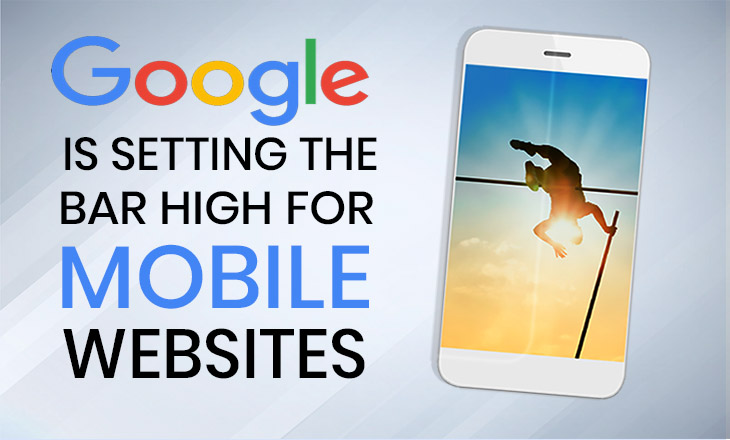
Google is Setting the Bar High for Mobile Websites

Posted by Netmatters
The clock is ticking for websites to provide a quality mobile experience. The reason behind this? Google has recently announced that it will penalise companies with sub-standard mobile websites. Want those coveted top search engine rankings? You’ll need to make sure mobile users have just as positive an experience on your website as desktop users would.
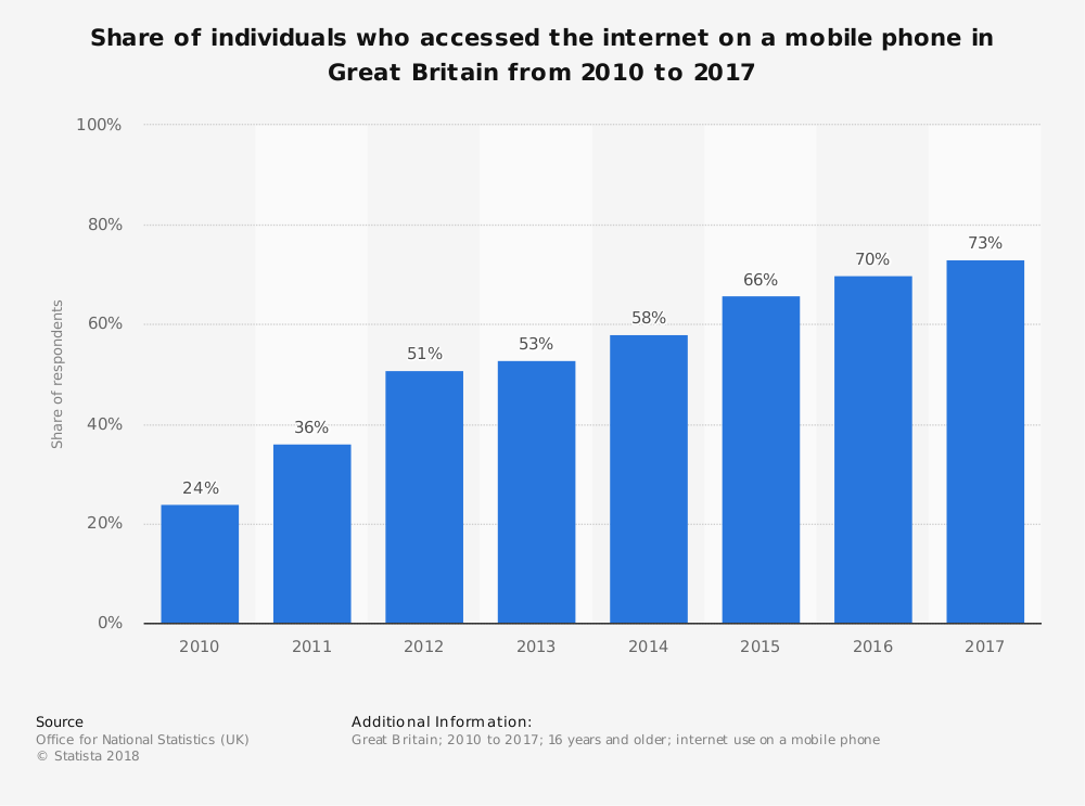
In 2014, mobile overtook desktop as the device most used for accessing the internet. Google now gets 60% of its search queries from mobile devices.
Source: Symetric.ca - May 2018
Why is Google Placing Such Importance on Mobile Experience?
Google holds the lion’s share of online search queries. To maintain their dominance in the market, they need to remain responsive to changes in online behaviour. With the introduction of smart phones, mobile has eclipsed desktop as the main way people use the internet – and it’s only going to grow.
So, not investing in a good quality mobile website means you may be neglecting the dominant channel for audience interaction.
Is Your Website your Company’s Main Source of Income?
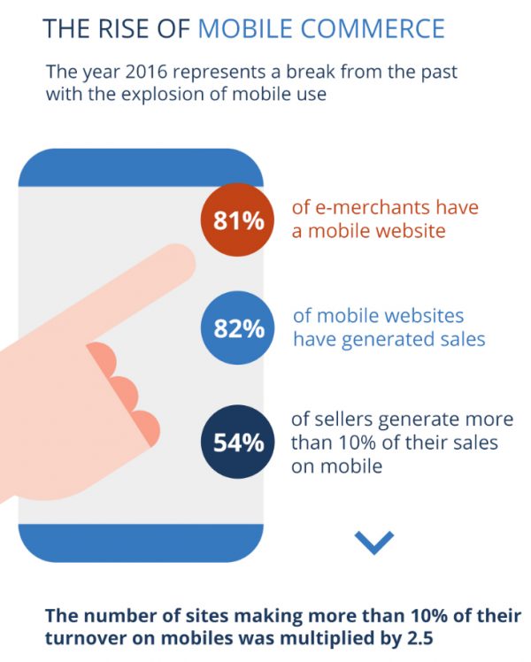
If the answer to the above question is yes, then you absolutely need to prioritise your mobile site.
The statistics on the right show how important a good mobile experience is for online shoppers. It’s not just a competitive advantage, it’s a necessity.
The reality is that most people use their mobile to shop. The challenge that online retailers face are the high expectations for mobile user experience.
When you’re on the go, you do not have time to wait for a website to load, or scroll through to find exactly what you are looking for.
It’s a highly competitive market, so if you do not optimise your website for mobile users, their loyalty to your brand will only take you so far.
What Does a Quality Mobile Website Mean?
There are three main ways of categorising websites that have been optimised for mobile users. Businesses can have a dedicated mobile version of their website. This usually looks more stripped back and minimal than a desktop website. This is so they can accommodate a smaller screen and less processing power.
Another option is to make your website responsive. This means that you will not have to create two separate websites. Instead, your website will naturally scale down to fit the size of a mobile screen. This is something that be achieved with help from the right web developer.
Finally, you can opt to have app content on your website. Many businesses use app content to create a personalised, mobile-friendly experience. For instance, e-commerce websites can use apps to provide users with real-time delivery tracking.
What links all the above paths of action is that they consider the unique needs of mobile users. But there are a lot of factors that go into a quality website, not just making it fit a smaller screen.
One of the most critical factors is load speed. Over half of mobile users have said that they will leave a website if it takes longer than three seconds to load. It’s relatively easy to fix this with the right technical know-how.
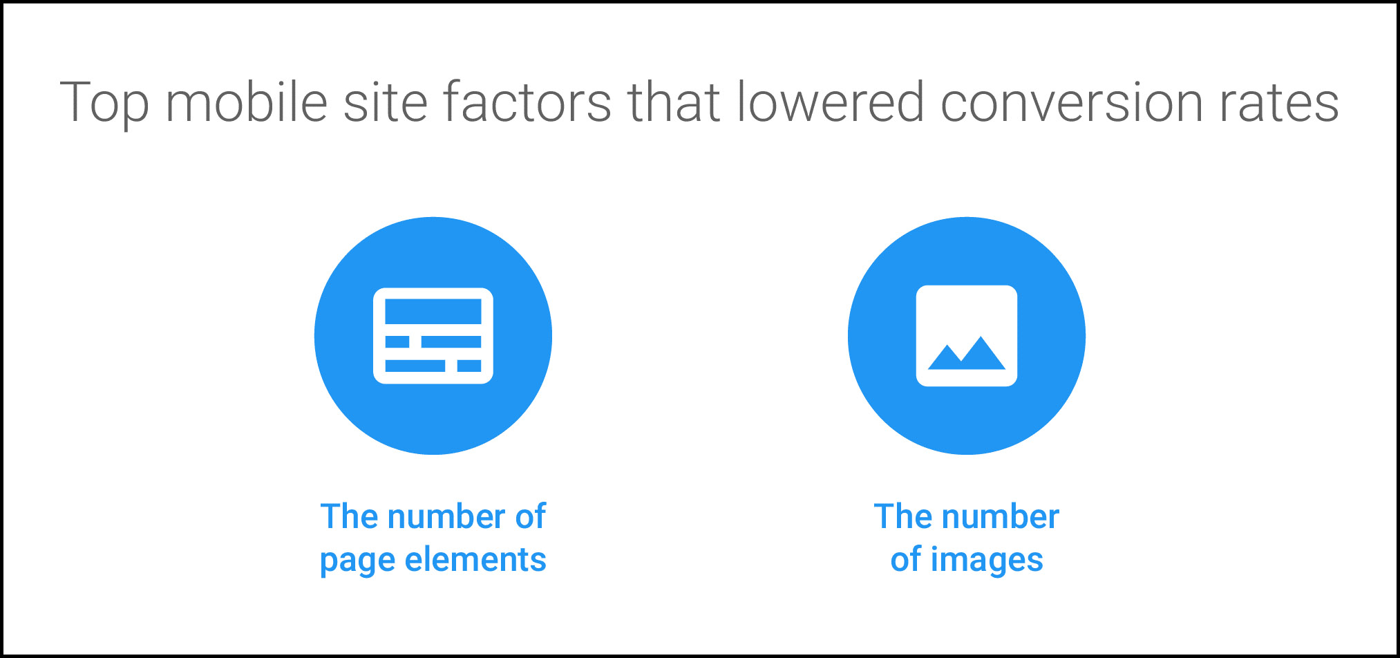
The golden rule for a mobile website is clear and simple navigation. As the above graphic provided by Google shows, the most important thing is to keep it simple.
Most mobile websites have a layout designed for vertical scrolling. Any links to important pages should be available through a prominent drop down menu. Finally, any call to action buttons, such as ‘Contact Us’ or ‘Subscribe’ should be as clear as possible. You should also make the buttons larger, as people are using their fingers rather than a mouse click.
So Is Mobile Experience the Most Important Thing for Search Engine Rankings?
As this article has explained, a quality mobile experience is more important than ever before. However, Google has a wide criteria to evaluate a website’s position in its rankings. As long as you provide your audience with the information they need in a timely and accessible manner, you shouldn’t have an overwhelming cause for concern. That being said, there is nothing wrong with making a good thing better. This is the attitude you should have when making improvements to your website.
As a full-service digital agency, we can provide all you need to meet and exceed the expectations of mobile users. Our digital team can audit your website for all Google’s benchmarks for a quality website. From that, our web developers can work with you to create a quality mobile website. We regularly review all of our clients’ websites, so you remain ahead of the curve in terms of industry standards.
If you want a website primed for success in 2018 and beyond, contact us via the form below or ring us on 01603 515007 for a FREE website assessment.