- Bespoke Software
- IT Support
- Digital Marketing
-
Telecoms
Services
- Our Telecoms Services
- Business Mobile
- Hosted VoIP Provider
- Business VoIP Systems
- Business Broadband
- Leased Lines Provider
- 3CX Systems
-
Web
Design
- Our Web Design Services
- Bespoke Website Design
- eCommerce Website Design
- Pay Monthly Websites
- Branding & Design
- Mobile App Development
- Web Hosting
- Cyber Security
-
Developer
Course
- Our Developer Course Services
- Train For A Career In Tech
- Skills Bootcamp
- Scion Scheme Frequently Asked Questions
- Scion Collaborators
Design & Development Trends for 2018

Posted by Netmatters
We're well into 2018 and, with a new year, comes new trials, technologies and trends. Keeping on top of emerging technologies and design trends is what helps us consistently deliver a high-quality product; well received and ideally suited to our clients businesses.
Being able to achieve a good balance between form and function can be a tricky process. However, when done effectively, this will lead to higher visitor engagement level; ultimately resulting in an increase leads and sales, for your business. Does your website sell your brand effectively? Do you have any development plans this year?
Voice User Interface and Search

Throughout 2017 we have all - undoubtedly - seen an increase of devices, which make use of a voice user interface such as Siri, Cortana and Alexa. This system has been immensely refined since its original conception in, believe it or not, the 1950’s! Back then, computers could only recognise digits from a single voice. We now have a system which can act on complex voice inputs and, when combined with machine learning, one that opens up a whole new door when it comes to how we use the internet.
You can expect to see voice recognition interfaces being used on a great number more websites over the coming year, whether they have their own system in place or are making use of integration with an existing one. This in turn will require us to revist the way we write and publish content for sites. Is it being written with conversational tone? Will it translate well, with regards to voice commands? One example would be that a user types in to Google “coffee shop Wymondham”, but when using voice command, will more likely ask Siri, “Where is the nearest coffee shop?”
"52.64% of global traffic for 2017 came from mobile"
Making Mobile a Priority
According to Statista.com, 52.64% of global online traffic for 2017 came from a mobile device; up from 43.6% in 2016, and even further from 35.1% in 2015. Mobiles are rapidly becoming the "go to" device for users, due to both how readily available they are to the public, and the array situations in which they can be used. Unlike desktops, and most laptops/tablets, there's no need for a wired or WiFi connection, in order to browse the internet and view websites. Most - if not all - mobile telecom providers offer cheaply available data-packages, alongside calls and texts.
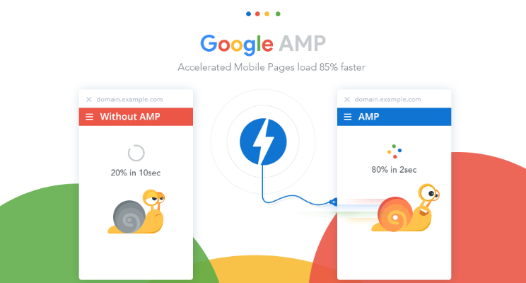
AMP (Accelerated Mobile Pages) is still a relatively fresh to market, open-source coding standard, for publishers. The core idea behind AMP is to encourage publishers to strip the content from their heavily styled websites, enabling the message to load very swiftly on a mobile device; deviating away from the mobile responsive design that a vast majority of websites utilise currently, which can often be resource heavy and bulky for slower load times and greater data-consumption.
"No user wants a slow loading website"
Google continues to offer public backing to AMP, encouraging websites - most notably news publishers - to follow suit; improving the speed and resource required for consumers to digest content on mobile devices. No user wants a slow loading website, and you don’t want a competitor who utilises AMP, to be the more appealing customer choice.
Brighter Colours
"Deliver a vibrant colour palette"
A common sight across the internet over the last year is that of a practice, dubbed ‘Flat-Design’. This style is not ready to leave us just yet, but it is evolving. The use of bright and flat colours has been welcomed in the recent past and, in it’s evolution, we can expect to see a few design taboos coming through; features like gradients and drop shadows. The key to success - especially for early adopters - is to ensure these are used in moderation.
Over use of these gradients and drop shadows can, and probably will, cause your website to look like it has fallen through a portal back to the '00s era of web headers and Powerpoint presentations. However, when done correctly these methods will provide a pleasant change from what is now considered 'the norm', delivering a vibrant and updated colour palette of softer, more subtle tones. These styles are already making an appearance on brands assets, including Apple’s iOS icons and Instagram.
Bold Font Choices
What is the value in catching a user’s attention with a lovely, bright and engaging website, if your content looks dull and boring? Typography is a very powerful tool and, again, when used correctly can become synonymous with your brand. Just think about big brands and their marketing choices. Consider Coca-Cola or Ford, and the bold typography they use within their logo design.
Custom and intricately designed typefaces are expected to be on the increase this coming year, bringing a greater - unique - personality to your website. Typographic 'cut-outs' are also expected to see an increase in use; though the balance between colour and text is far less forgiving. This technique employs the use of a large block of colour over a still or moving image, allowing this image visibility through the clear lettering 'cut' from the block of colour.
Another trend worthy of mention, and one that is expected to be on the increase, is the use of contrasting Serif and Sans-Serif fonts. This particular style trend is used to create an air of dynamism on the page, leading to some very interesting pairings; many of which, will likely not have been seen in situ, together before.
Unique Graphics
Graphic design often takes a back seat when it comes to standard web design. Fortunately, it has great potential that - when explored - can do wonderful things for acquiring user attention and engaging with them on a new level.
Line Art icons, like the examples below, will continue to be utilised in a wide variety of web design due to their light appearance, performance and usability.

Animation is everywhere on the internet nowadays, in large part, due to the web browsers handling of this functionality and the speed of connectivity drastically improving in recent years. All browser are now able to handle the small and subtle animations which we will begin to become accustomed to in 2018. Keep an eye out for subtly animated brand logos on their respective websites, ushering in a new era for web animations in 2018; and a far cry from the flashing and distracting animations of yesteryear.
Do these design trends spark an interest with you? An updated website that provides a rich experience for all, can dramatically increase the amount of users that use your website. A simple yet powerful website, employing a new look at mobile devices - with a key focus on providing the best user experience in all instance - should be the focus.
If your website doesn't fulfil this brief, maybe it's time to consider a refresh...
For more information, contact us via the form below or ring us on 01603 515007 today.